OX GROUP TOOLS
| Client | OX |
| Sector | Consumer, Industrial |
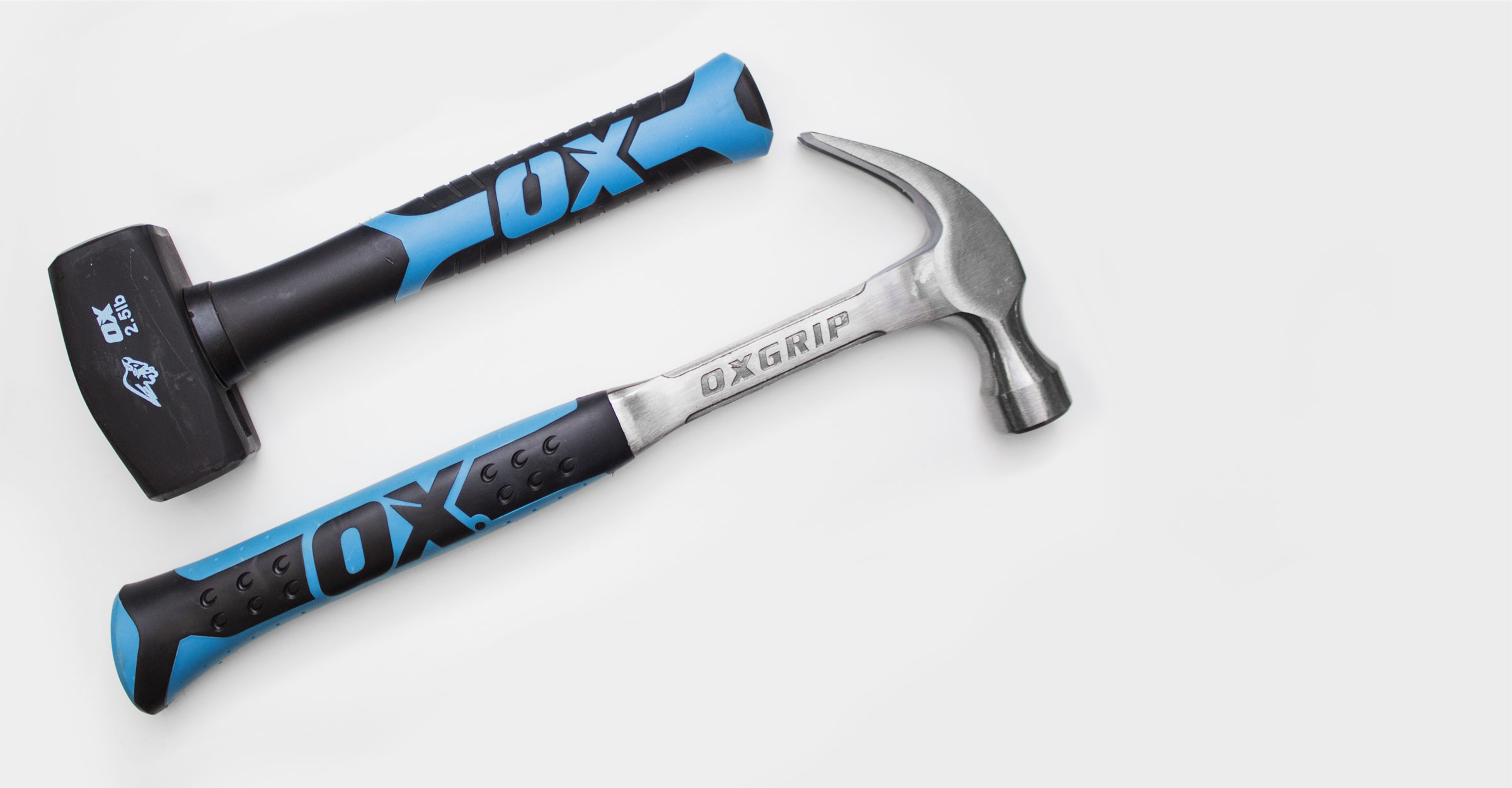
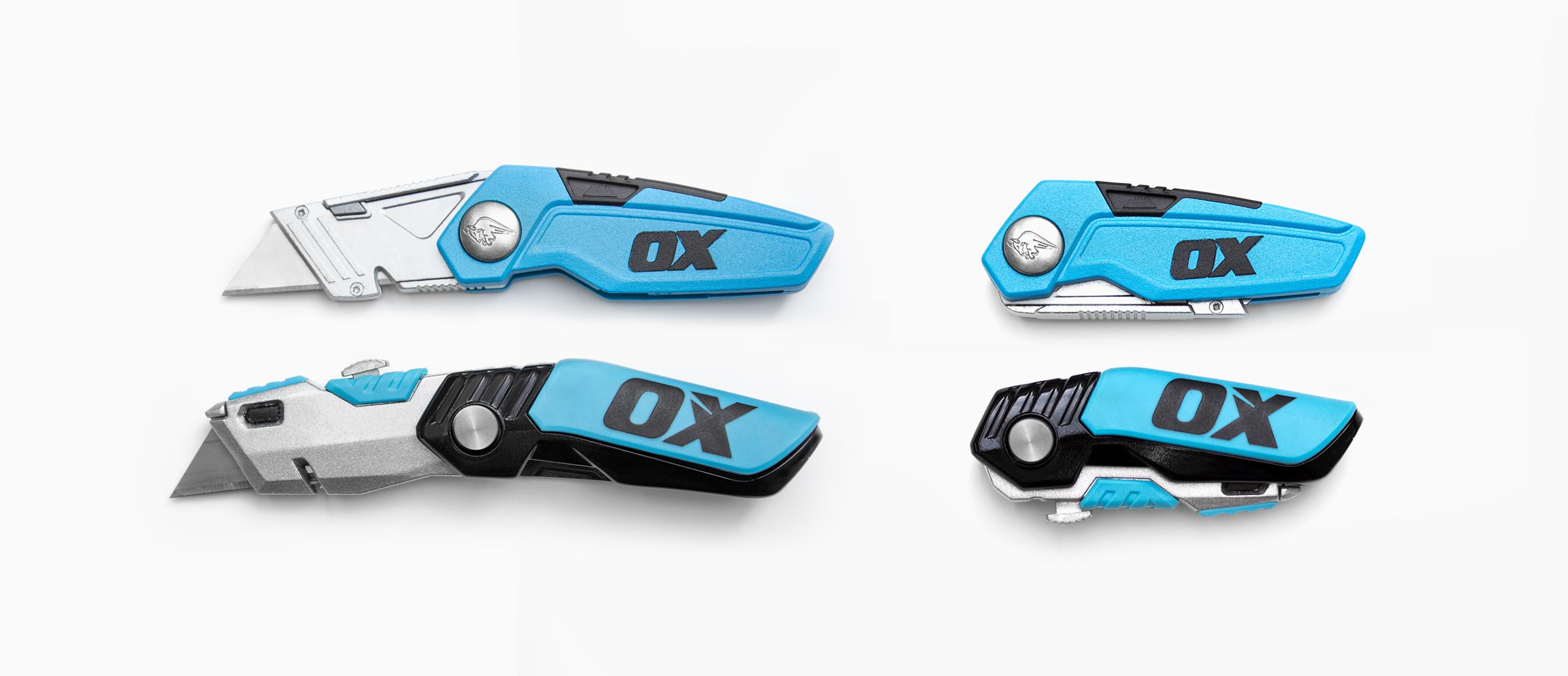
Ox partnered with Smallfry to bring a welcome fresh air and unity to their product and branding. We needed to honour Ox’s products by making them appear as tough and dependable as they were, but without relying on the same design cues that designers have used for decades. These tools needed to be the first choice for a discerning trade customer.


Ox uses powerful brand language. A simple bold name, it’s logo a dynamic bull crashing forward. If we wanted Ox to be memorable, the Ox brand had to take the centre stage, not the product itself.


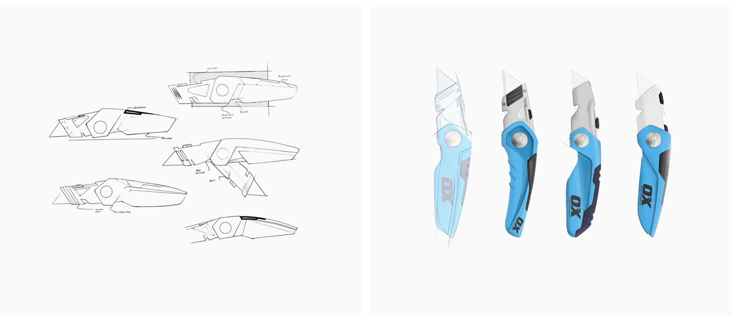
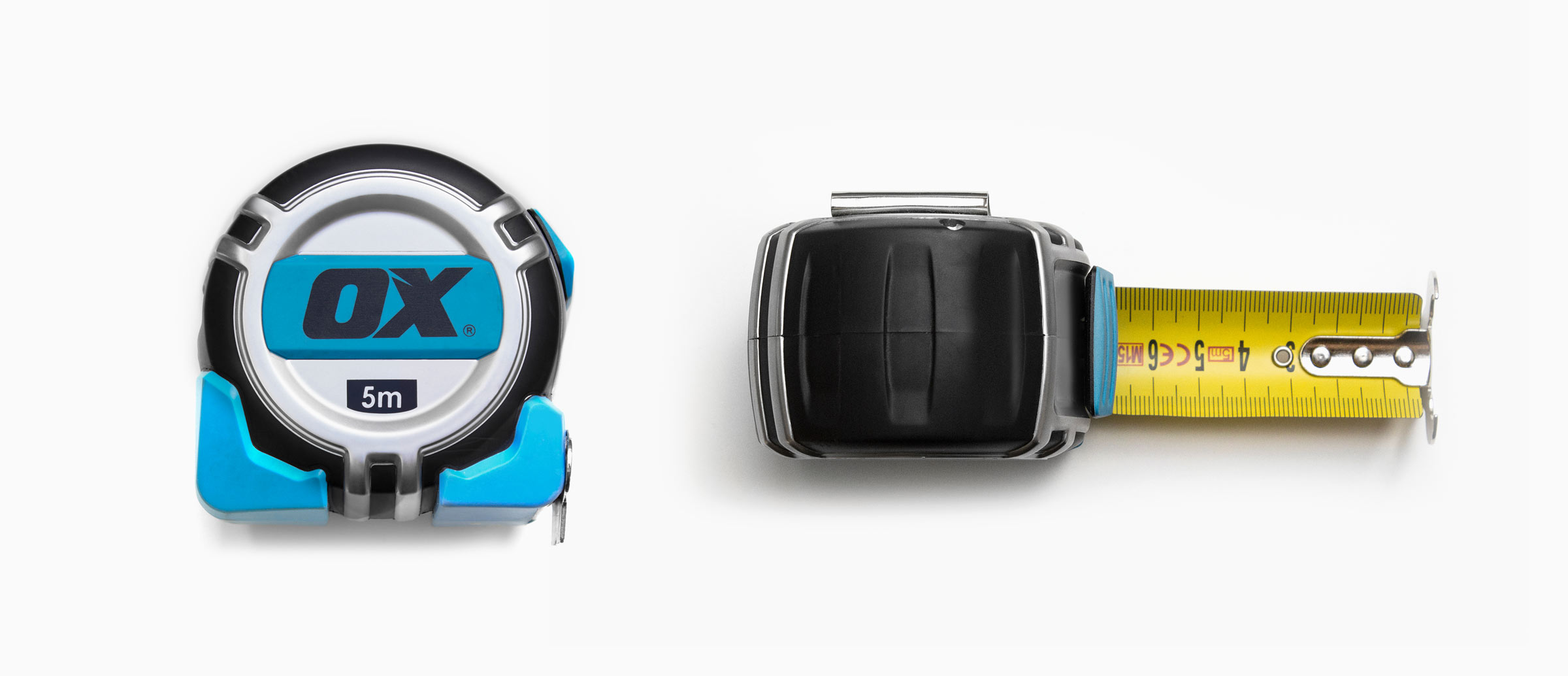
We simplified the layout to remove unnecessary visual noise. We gave Ox’s branding more space to breathe, our message: “these aren’t just tools, these are OX tools.” Our approach to all form changes were in service to the logo and moving the focus from the product onto the brand.

By putting the Ox brand in the centre of the form design we have deliberately created a range that the professionals would notice. But we still needed people to trust the brand. We designed subtle forms around the branding making the products appear dependable and tough while striving to ensure they actually were. With this pedigree ‘vision’ we helped craft a reliable tool brand that finally stands out, even to the sceptical trade customers who are naturally cynical of superfluous fluff.